
Redefining Tray.io’s Web Presence
Tray.io brought me on as their web design consultant to turn a static brand guide into a dynamic, scalable website. From IA to illustration, I helped translate a complex automation platform into a clear, human-centered digital experience that’s both high-performing and emotionally resonant.
Worked on
Web Art Direction
UX/UI Design
Design Systems
Illustration Strategy
Component Library
Tray.io needed a new website on a startup timeline. i.e. fast. I adapted their new brand for web and designed 30+ pages in three months.
Abstract product.
Real personal impact.
Big expectations.
Tray.io’s cloud automation platform is powerful—but difficult to visualize. The brand team had developed a fresh look and feel, but there was no web strategy in place to carry it through. My job was to bring clarity to complexity: turn abstract tech into an intuitive, compelling, and scalable web presence.

I used quadrant and spectrum mapping to quickly align the team on tone, visual direction, and user priorities—establishing a clear foundation for translating the brand into a scalable web experience.
Aligning on Direction


Illustrating Impact, Not Just Features
To make cloud automation feel more tangible, I developed a visual language rooted in clarity and outcome. The style balanced abstract tech concepts with real-world impact—highlighting the humans who benefit from the platform. Motion and modularity made the system both expressive and scalable.


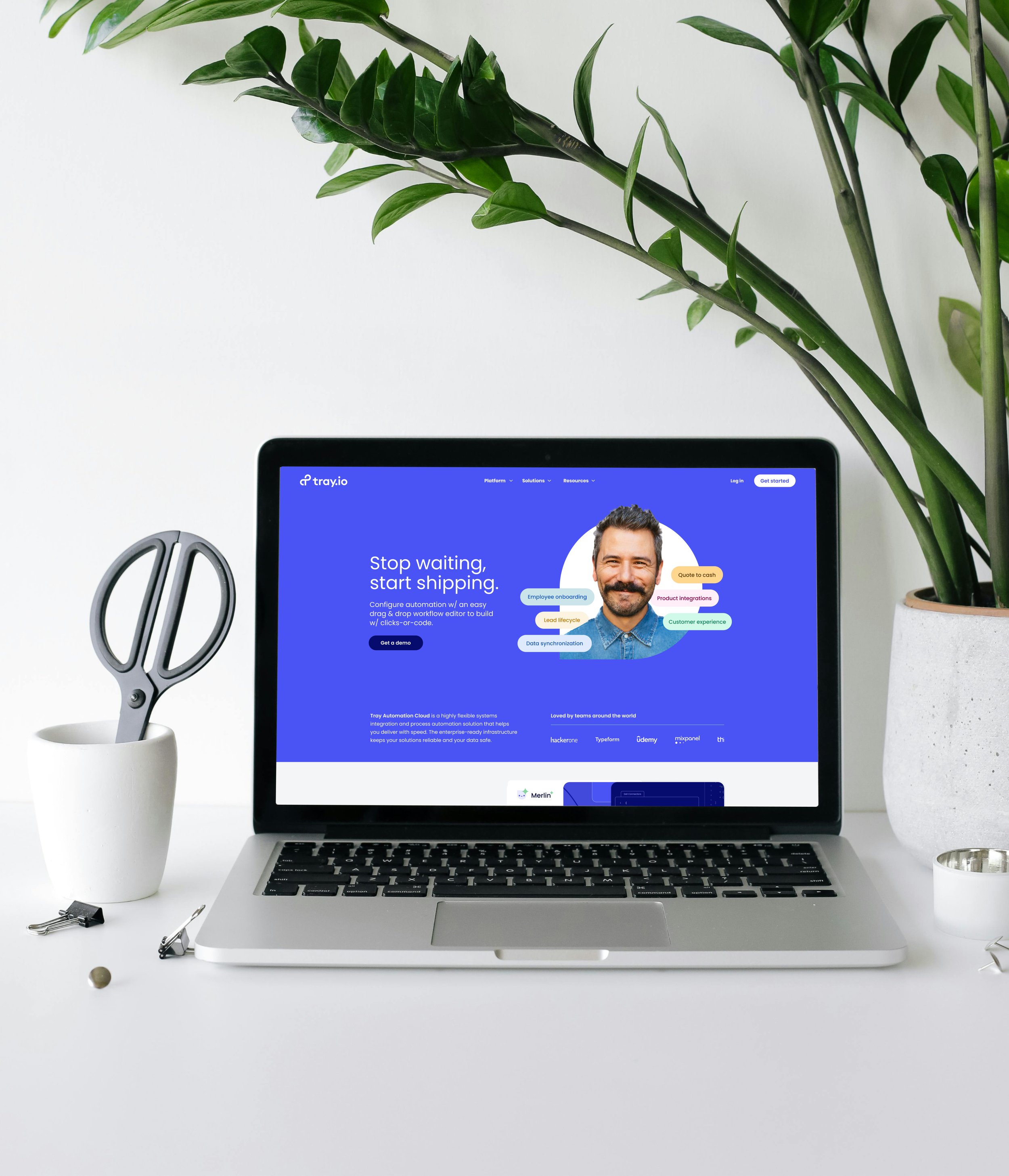
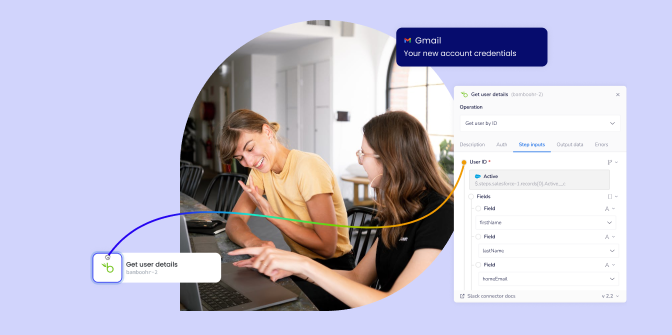
Product + People = Trust
I created a hero style that blended human faces with product visuals, helping visitors quickly understand who Tray is for and what it enables. This approach balanced technical capability with emotional clarity—showing not just what the platform does, but how it improves the lives of the people who use it.


Designing for Growth
I built a library of flexible modules made up of components and page templates, empowering the internal team to scale the site without reinventing the wheel. The result was a clean, extensible system that made future content creation faster, more consistent, and on-brand by default.


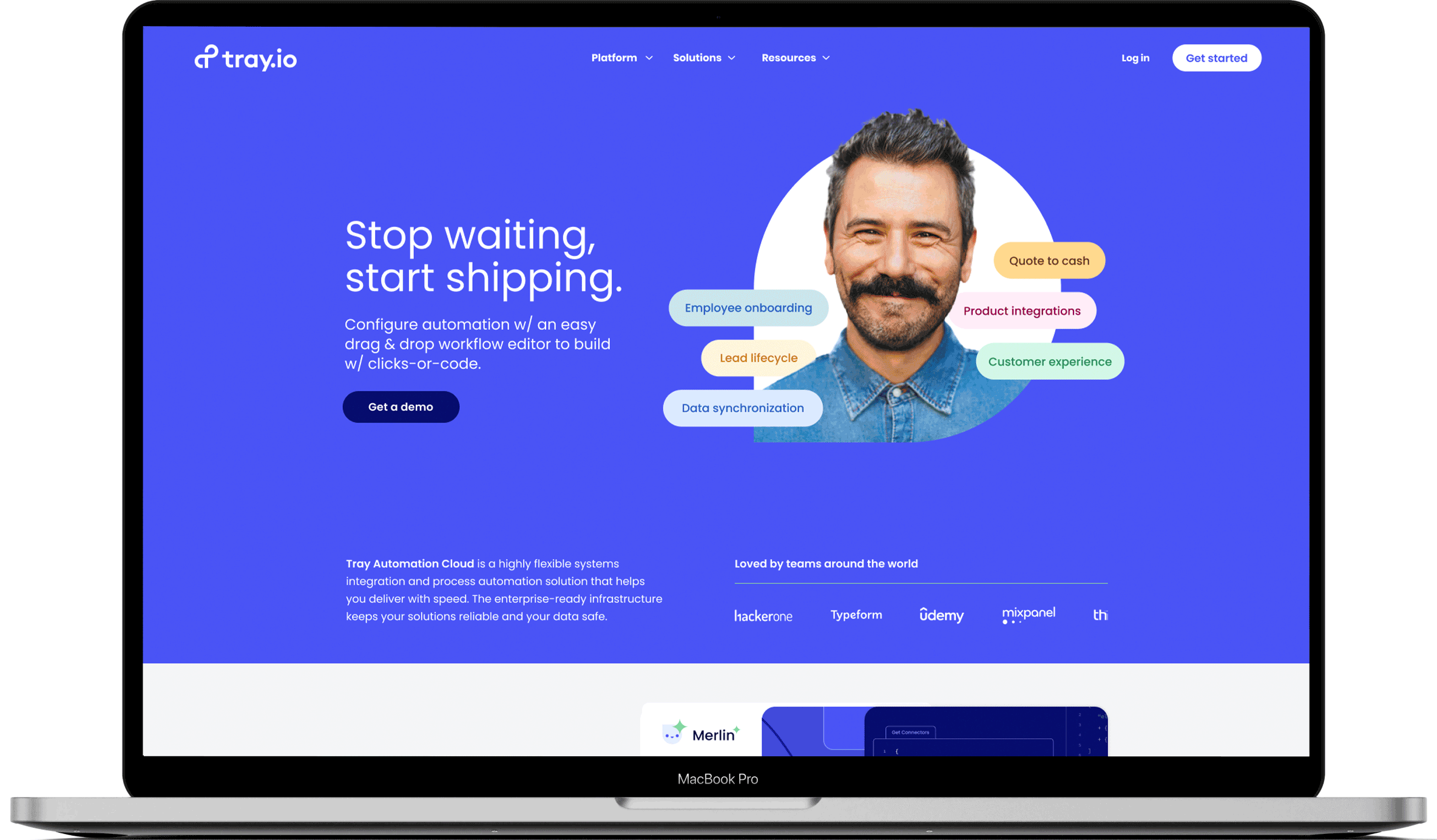
Homepage design
A refreshed homepage that brings Tray.io’s platform to life with interactive product storytelling, human-centered visuals, and animation. I completed three iterations over several years, below is the initial redesign. What you see live will vary.
Appendix
Blog Guidance
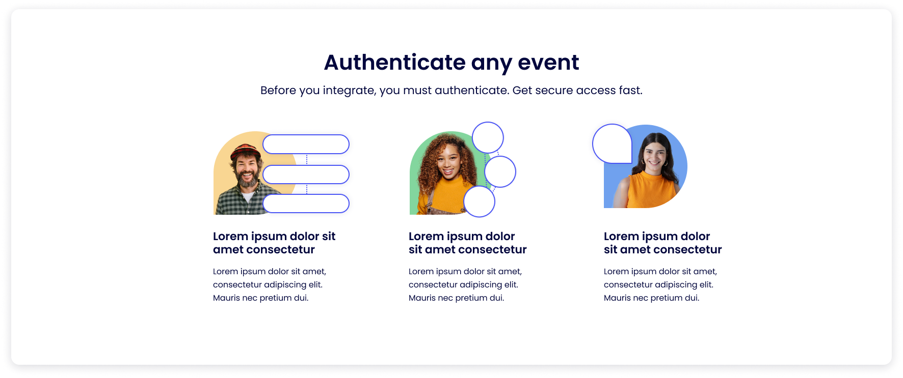
To support content consistency and flexibility, I created a library of sample blog images—a visual toolkit the Tray team could use as a reference for future posts. This system gave them variety while maintaining a cohesive look across the site.


Lottie animation
I used Lottie animations—SVGs embedded as lightweight JSON files—to bring key sections of the page to life and visually illustrate new features without compromising performance or load time.